Is this week seven? I feel like as it might as well be week four. Time goes so fast! But yes, we have almost spent two months on this project and what was mere ideas is now starting to become reality. It’s quite amazing to see.
Now when the game itself has got some flesh on it’s bones it’s time to pay some attention on all the other aspects around a game, like the game menu. One might think that it’s the quickest and easiest thing in the world to do. And sure, it might be a lot less time consuming than animating. But a menu has to be easy to understand and to navigate. And it should also fit into the aesthetics of the game to give the player the right first impression. So it takes some more time and effort than one imagines at first.
I started with trying out different designs on a sample of the menu background, to be able to have an idea of the composition. I played around with our style keywords such as comic books, airports and 80’s neon. Quick samples and sketches saves a lot of brainpower and time in the long run in my opinion.

If you want to see the latest version of the background, be sure to check it out in my group mate Camillas blog.
As you can see, I tried to merge several of the keywords together to see if anything good came out of it. It was difficult to merge the comic book style with anything as it felt like the whole aspect of comics didn’t come across to the viewer anymore, if we did any changes to it. The plain black and white one looked fine to me, but it wasn’t very interesting. So then I went for merging an airport flight board with the 80’s neon theme and quickly realized that it was much easier to work with. It will also work very nicely with the background when it’s all finished and in color.
In the end I went for the style with separate frames for each button, to give the player the most visual feedback possible when they are using the menu. It also lets more of the nice background be visible.
This is the fist version of the button design:
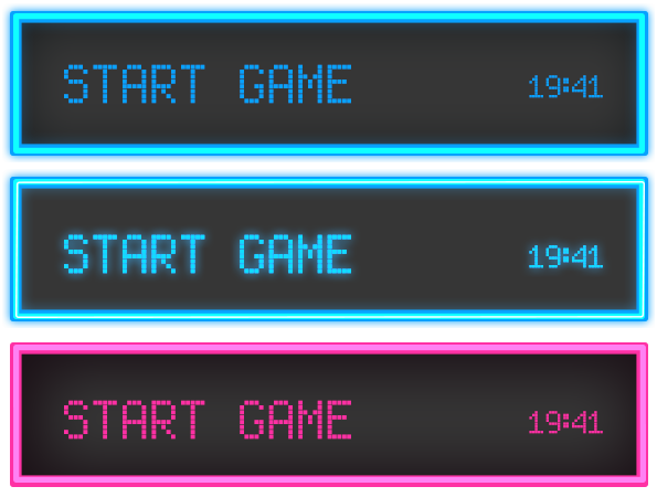
The first button is for when the player is not interacting with it. The second is for hovering over it and the third is when pressed down. These specific colors have been chosen from our mood board to complement our theme of the game. I’ve played around with blending modes such as inner and outer glow, linear dodge (for the lit up effect) and some overlay for shading the grey background. The fond is called Enhanced LED Board-7 and was found at dafont.
Tomorrow we will most likely implement and test the buttons, to then continue with designing the options screen.


