So we went through lots of tutorials today about the way light works and different terms and phenomenons when it comes to lighting. Also, we quickly went through some camera effects which we can try to replicate in our artwork. I didn’t write everything down, but I took some notes. I’ll share them in this post in hope that it will be of help for somebody. Mind you, these are my quick, unedited notes.
Lighting
Rim light – the light, whitish edges you can add to items if the lighting is not straight on, to give more volume
Specular highlights – the official term of those white specks of highlight which shiny items omit that we all like
Ambient Occlusion – when light omits from a not as direct light source, like the sky, where light comes from many directions. Then the shadows become soft and gradient, where the darkest spots are where the object touches something else like the ground.
Sub-surface scattering – the glow that occurs when light travels through something translucent (the in between of transparent and opaque, or thin objects where light is allowed to shine through) Like ears, leaves and fabrics.
Fresnel – the way reflections play depending on which angle you are looking from
Opalescence – facial ratio effect that affects what something looks like depending on the angle you are looking from. Makes the surface material of the object more visible. Used to give soft edges to things like sweatshirts, fuzzy skin, and jellyfish.
Volumetric lighting – how contrast goes down on things the further away they are. You can see this everywhere, be it under water, in fog, city- and nature landscapes.
Atmospheric specular delusion – sunbeams! When you are facing the light source and it gives off the illusion of glow in the atmosphere.
Camera
Camera Bloom – when the light is too bright for the camera to comprehend and a glow occurs around the highlighted areas.
Bokeh – A depth of field effect. When changing focus on your camera and a blow out of light occurs.
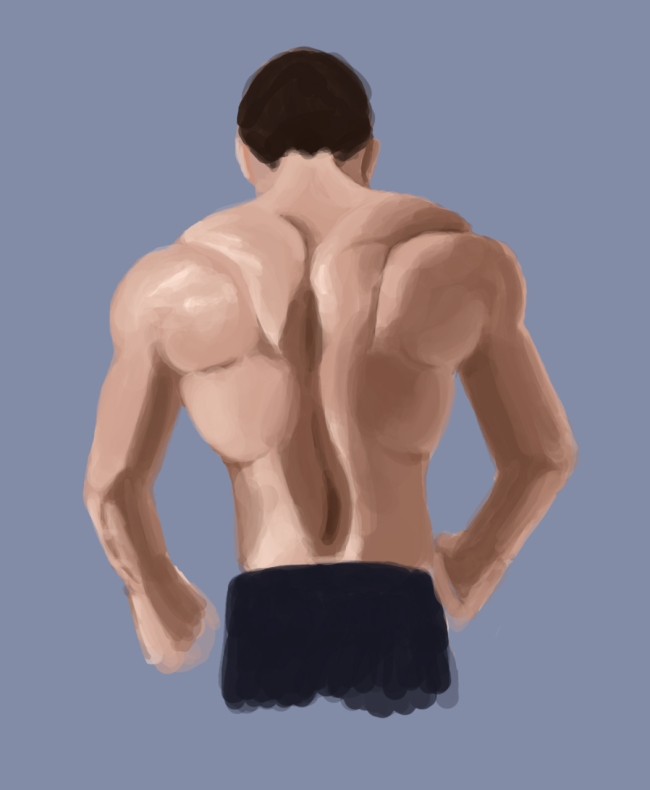
We practiced drawing with a triad color scheme as well, but it didn’t go well for me. I am not good at rendering light and shadows yet so I ended up redoing it over and over again. Therefor I don’t have anything to share from that assignment. But when I got home I did a study of back muscles, keeping in mind what I had learnt about light and shadows. I used three different colors for lit, “normal”, and shadowed skin. Enjoy!
